
Lucidity work
Why Weight
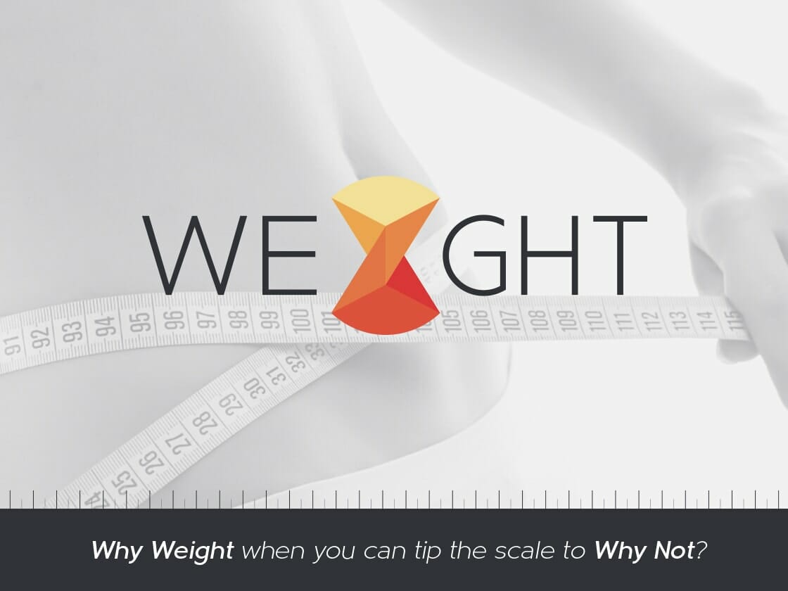
Why Weight brings a broader design system to its public-facing work, extending beyond the core logo & branding website into the practical materials around it.
Services
Logo & Branding, Website
Working focus
The direction connects the visual language with the working formats around it, giving the project enough structure to remain clear across different moments of use.
Summary
Why Weight brings a broader design system to its public-facing work, extending beyond the core logo & branding website into the practical materials around it.
Creative direction
The direction connects the visual language with the working formats around it, giving the project enough structure to remain clear across different moments of use.
The work
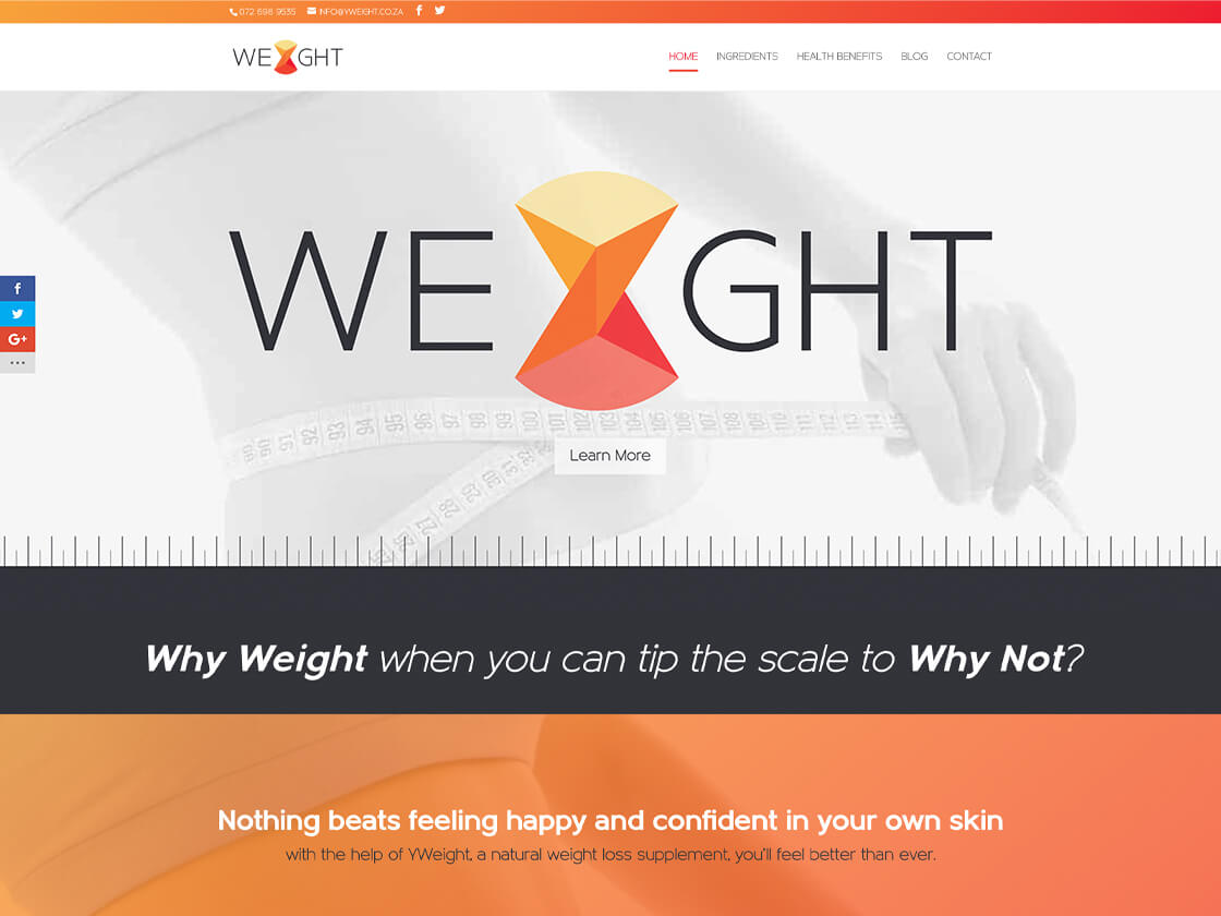
The work covered strategy, design and development for the logo, brand and website, including copywriting; a website care plan including hosting; packaging, labels, stickers and collateral; and a social-media pack with elements and multiple posts.
Services
- Logo & Branding
- Website
Selected work
Explore the work
Have a project to discuss?
Bring the context, constraints and decision to make. I’ll help identify the clearest useful next step.
Book a conversation