
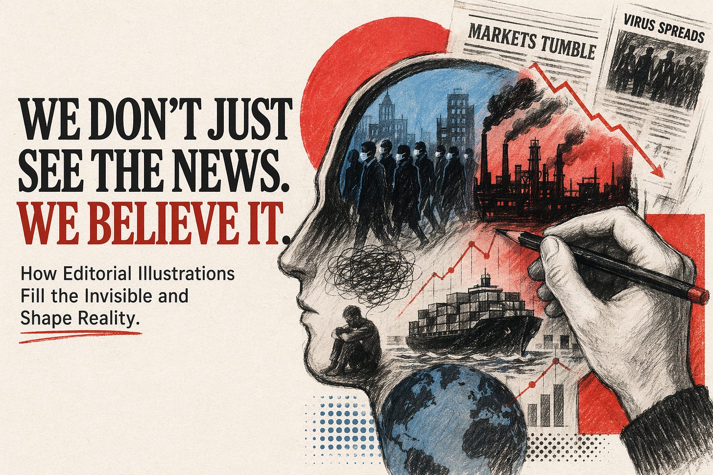
TL;DR: We still talk about editorial illustration as if it is decoration. It is not. It is often the first argument a reader meets, the frame that tells them what kind of reality they are entering before the text has even had its chance.
You think you read the news.
Usually, you feel it first.
A face melts.
A market becomes a maze.
A virus grows fingers.
Before the headline lands, the drawing has already made its case.
Prefer to listen? Start here.
The scene
You open a news site while half-distracted, coffee in one hand, ten tabs already open, brain running on fumes.
You do not begin with neutral analysis. You begin with a visual cue. A sharp caricature. A symbolic cover. A neatly engineered diagram that tells you whether this story is absurd, frightening, tragic, corrupt, or urgent.
By the time you reach the first sentence, your interpretation is already leaning in a direction.
The thing people get wrong
Most people still treat editorial illustration like garnish.
A nice splash of colour. A mood-setter. Something to break up the wall of text.
That is the misunderstanding.
The image is not sitting beside the article as a passive companion. It is doing editorial work of its own. It frames the subject, selects the emotional temperature, and compresses a point of view into a form the brain can grasp in seconds.
That is why the lazy line about “just a drawing” misses the point completely.
What’s actually going on
Editorial illustration works because it can do three jobs faster than most writing can.
It pre-loads meaning. The reader does not meet a blank page; they meet an argument already encoded in line, colour, symbol, scale, and composition.
It makes the invisible visible. A camera can capture a moment, but it struggles with systems, abstractions, slow violence, psychological pressure, ideology, blame, or economic collapse.
It condenses complexity. A good illustration can collapse a messy political or social condition into one memorable visual metaphor without pretending the subject is simple.
That is the real power here: not decoration, but compression.
A photograph may show what happened.
An editorial illustration can suggest what it means.
That is also why it sticks. We remember the image that crystallised the moment, not always the paragraph that explained it.
This is where editorial illustration earns its keep: it gives form to systems, pressures, and truths a camera cannot fully hold.
Editorial Illustration Earns Its KeepWatch
The trade-off
This power is not neutral.
That is the bargain.
Illustration can clarify, provoke, humanise, expose, and make abstract issues legible. It can also manipulate, oversimplify, flatter a publication’s bias, or smuggle in ideology under the cover of wit.
Every choice matters: the metaphor chosen, the angle taken, the expression exaggerated, the symbol repeated, the palette sharpened, the thing left out.
So yes, illustration can bypass the dead weight of literalism. But it does not arrive innocent. It arrives authored.
That is not a flaw. It is a responsibility.
The better move
We should stop asking whether editorial illustration is “objective” and ask a better question instead:
What is this image trying to make me believe before I have fully read the story?
That single shift makes you a better reader.
It also makes you a better commissioner, editor, illustrator, and designer.
Because once you accept that the image is part of the journalism, not a decorative extra, the brief changes. Research matters more. Symbol choice matters more. Audience decoding matters more. Ethics matter more.
And frankly, the work gets better.
gument a reader meets, the frame that tells them what kind of reality they are entering before the text has even had its chance.
Want the deeper theory, visual frameworks, and historical through-line? Dip into the companion PDF.
The Editorial CatalystDownload
Quick test
Use these checks the next time a news image grabs you.
What did I feel before I consciously understood the headline?
What metaphor is doing the heavy lifting here?
What has been simplified, exaggerated, or left out?
Could the same article carry a different meaning with a different image?
Is this illustration clarifying reality, or steering me too neatly toward one reading?
Try this
Here is a small media-literacy workflow worth stealing.
Step 1: Pause on the image before reading the article.
Step 2: Name the emotion it pushes first: fear, empathy, ridicule, urgency, grief, suspicion, hope.
Step 3: Identify the visual device: caricature, diagram, symbolism, exaggeration, parody, visual pun, or metaphor.
Step 4: Read the article and compare your first impression with the written argument.
If the gap is wide, the illustration was not incidental.
It was editorial.
Closing
The old mistake is to think the headline carries the truth and the image merely dresses it.
Often the opposite is closer.
The drawing gets there first.
It sets the weather in your head.
It tells you where to stand.
It offers a version of reality before the article has even cleared its throat.
The smart response is not to distrust illustration.
It is to read it properly.
And if you want the short version of why a single image can outlast a thousand words, this is the one to watch.
Why a Single Image Can Outlast a Thousand WordsWatch
If you’re still reading (sharp)
Hit reply with DRAWING if you want a follow-up on how to brief better editorial illustrations for articles, campaigns, or brand publishing. Or tell me where you think I’m completely wrong.
That’s the best part of the internet when it’s working: we make each other sharper.

No published comments yet.