
TL;DR: This case study is from 2019 — no AI, no shortcuts. I built clarity the hard way: interviews, research, and iterative structuring until the story held. Centricity helps businesses digitise and manage processes and workforce operations, but the market didn’t need “better design” — it needed a better explanation. Here’s how I turned a broad, complex product suite into pain-point-led messaging and a simple user journey that helps non-technical decision-makers quickly find the right solution (and actually feel confident clicking Get Started).
The process challenge: clarity before creativity
Centricity can do a lot: digitise processes, manage teams, reduce paper, tighten accountability, surface insight. It’s the kind of platform that makes day-to-day operations smoother — once you understand where it fits.
But that “once you understand” is the danger zone.
When software is powerful and broad, the marketing often drifts into two unhelpful extremes:
feature lists that assume technical fluency, or
vague promises that never connect to real pain.
The existing website and marketing came up short against the biggest challenge facing the business: a clear understanding of the solutions — and messaging that speaks directly to pain points, outcomes, and next steps.
The work: turning complexity into a clear journey
The client couldn’t brief the product clearly — and internally, not enough staff could explain how the platform worked in plain language (never mind communicate it clearly to the market).
So the job wasn’t only copywriting. It was sense-making:
understand the platform and how it’s sold
translate internal capability into external, buyer-friendly language
design a journey that reduces confusion and points people to the right area fast
How we approached it (2019: research first)
This was an empathy + intelligence job.
We aimed to gain complete insight into the offering through the same three levers we still use today: data analysis, customer interviews, and internal interviews.
Then we mapped the content around one simple rule:
Start with the problem the user recognises. Then show the path to the outcome they want.
The story we built: from chaos to control
Instead of leading with “Centricity is a platform that…”, we framed the journey around the reality many businesses live in:
a chaotic workplace
bottlenecks
quality gaps
high employee turnover
fragmented tools and processes
stretch goals with limited capacity
culture slipping as teams scale
The point wasn’t to dramatise. It was to mirror the user’s world — and show Centricity as the practical route from mess to momentum.
How we structured the journey (starting at the homepage)
We treated the front page as a decision filter.
It had to quickly communicate:
what Centricity helps you do (in plain language)
why it matters (outcomes that map to pain)
how you get started (a clear CTA)
Key value points we prioritised:
create workflows on your own
pricing that fits even a small business budget
scale as your business grows
integrate with other platforms
Messaging and “catch phrases” (used as scaffolding)
To keep copy consistent across pages and touchpoints, we created a set of anchor lines that could be adapted per solution:
Run your business hassle free
Everything you need for smart processes
See what powerful and easy process management feels like
Keep it smart with a unified digital workplace
One platform to optimise, manage, and track all of your work — from any mobile device or browser
We also introduced proof-led placeholders (designed to be swapped for real numbers when available):
Learn how “Company” is saving Rand Value per year on their systems of record
Feature language: translated into human outcomes
Centricity has serious capability — but the goal wasn’t to dump a feature list. It was to translate capability into outcomes a buyer can understand.
So we grouped the platform story into themes that non-technical decision-makers can scan quickly:
Streamlined: real-time dashboards, visual workflow building, audit trails, and reporting that surfaces bottlenecks.
Agile: smart routing, fast deployment, flexible rules, and mid-process reassignment.
Convenient: an intuitive UI, multi-device access, and code-free forms.
Powerful: automation, integrations (e.g. Zapier), orchestration via API, scalability, and SLA control.
Team-friendly: collaboration in-context, mobility, document sharing, and smart alerts.
If the reader wants depth, we can go deeper — but first we help them understand where it fits and why it matters.
Why this matters (and where companies get it wrong)
When a product is complex, the real commercial risk isn’t competition — it’s confusion.
If buyers can’t explain what you do in one breath, they can’t justify budget, they can’t sell it internally, and they default to “we’ll come back to it later” (which is usually a polite no).
This is where a lot of companies slip:
They write for insiders. The website reads like internal documentation, not buyer language.
They lead with features instead of outcomes. Capability is listed, but the ‘why it matters’ is missing.
They bundle everything under one vague umbrella. “A platform that does everything” sounds like “nothing specific”.
They skip the journey. Pages exist, but there’s no path that helps different users self-identify and move forward.
They treat copy as decoration. Messaging is added after design, so the story never fully clicks.
The fix isn’t louder marketing.
It’s a clearer narrative, built from real customer pain, mapped to real solutions, and expressed in language the market actually uses.
Wireframes (why they look “simple” on purpose)
The visuals below show hierarchy and flow, not final UI.
The Figma screens included in this case study are low-fidelity wireframes.
 Centricity Strategy Content Case Study 2019Download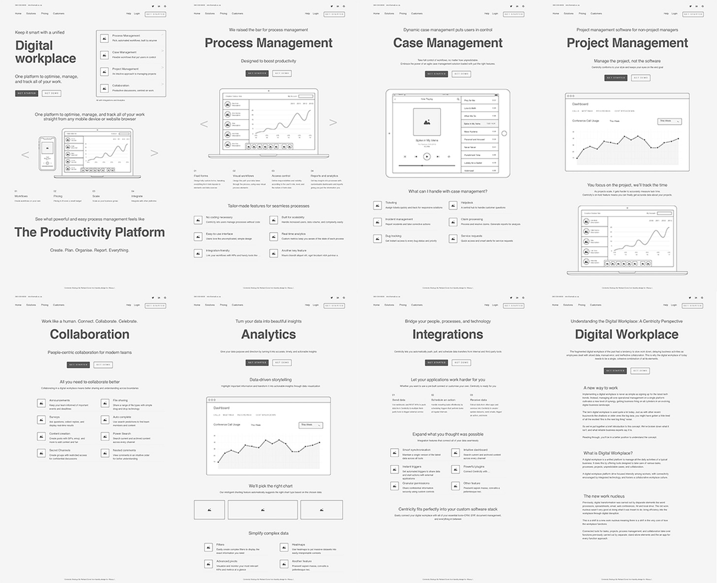
That’s intentional: the goal wasn’t visual polish — it was to lock:
information architecture
user journey and page intent
messaging hierarchy (what must be understood first)
In other words: structure before style.
Visual design and brand styling come after the flow and copy are proven.
Low-fi also let us iterate faster with stakeholders: agree the journey and the words first, then commit to UI.
What was involved (scope snapshot)
This project was delivered in three phases:
Discovery (±13.5 hours): research and insight gathering through data analysis, customer interviews, and internal interviews.
Strategy (±39 hours): site strategy covering pages, navigation, conversion paths, and the overarching approach — presented for review and iteration.
Wireframing (±12 hours): low-fidelity wireframes showing navigation, page layouts, and copy so we could iterate quickly until alignment.
The new structure: content shaped by user experience
Instead of forcing everything into one generic “product” page, the site structure was defined by how a user searches, compares, and decides.
Proposed navigation / page set:
Home
Process Management
Case Management
Project Management
Collaboration
Analytics
Integrations
Digital Workplace
Each page is designed to answer the same set of buyer questions:
What is this (in plain language)?
Who is it for?
What problems does it solve?
What does “better” look like?
How do I get started?
What improved (before → after)
Even without fancy dashboards or AI tooling, the biggest gains were practical:
From “platform talk” → buyer talk: messaging shifted from internal module language to outcomes and use-cases.
From vague breadth → clear paths: the site stopped trying to explain everything at once and started routing users to the right solution.
From jargon → approachable clarity: headings and page flow were designed for readers scanning for relevance.
From scattered pages → consistent page intent: each page followed the same decision logic and CTA structure.
From opinions → alignment: internal stakeholders had a shared, repeatable explanation of the product.
From “where do I send them?” → “start here”: sales could point prospects to a single, relevant page per need — without a custom explanation every time.
What changed (the real deliverable)
This wasn’t a “copy refresh”. It was a shift in how the product is presented:
from features → pain points and outcomes
from broad platform → solution-led journey
from jargon → approachable, human language
from scattered pages → a coherent narrative across touchpoints
What you can learn from this (and apply yourself)
If you’re working on a complex product — especially one sold to non-technical buyers — you can borrow this approach without a big budget.
1) Start with the buyer’s reality, not your platform
Write down the top 5–8 problems your customer would recognise before they ever care about features. If the pain doesn’t feel real, the solution won’t feel urgent.
2) Turn capability into outcomes
For every feature, ask: So what? Then answer in plain language.
Feature: “Dynamic routing” → Outcome: “Work goes to the right person automatically, without chasing.”
Feature: “Audit trail” → Outcome: “You can prove what happened, when, and who approved it.”
3) Make the homepage a decision filter
Your homepage shouldn’t try to explain everything. It should help people quickly choose a path:
“If you’re trying to fix X, start here.”
“If you’re responsible for Y, here’s what to look at.”
4) Use a repeatable page template
Every solution page should answer the same five buyer questions:
What is this (plain language)?
Who is it for?
What problems does it solve?
What does better look like (proof, examples)?
What’s the next step (CTA)?
Consistency reduces cognitive load — and speeds internal buy-in.
5) Lock structure before style
Do low-fidelity wireframes first. If stakeholders can’t agree on the journey and the words, a polished UI will only make disagreements more expensive.
If you’re still reading (respect)
If you want a follow-up, hit reply with CLARITY and I’ll share a practical framework for writing solution pages for non‑technical buyers (headings, proof blocks, CTAs, and what to cut).
Or tell me where you think this approach falls apart.
That’s the best part of the internet when it’s working: we make each other sharper.


No published comments yet.